Fields
Field types
The list of field types available for creating:
- Varchar – a single-line text;
- Enum – a selectbox, only one value can be selected;
- Text – a multiline text with markdown support;
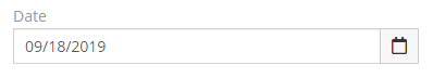
- Date – date w/o time;
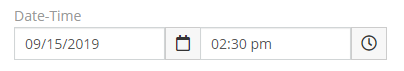
- Date-Time – date and time;
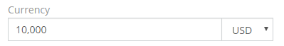
- Currency – for currency values, a float number and currency code;
- Int – a whole number;
- Float – a number with a decimal part;
- Decimal – a decimal number with fixed-point precision;
- Boolean – a checkbox;
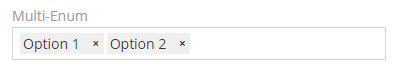
- Multi-Enum – a list of values, multiple values can be selected;
- Checklist – a list of checkboxes;
- Array – a list of values, similar to Multi-Enum field;
- Address – an address with street, city, state, postal code and country;
- Url – for storing links;
- Url-Multiple – for storing multiple links;
- Wysiwyg – similar to Text field, but with HTML support;
- File – for file uploading;
- Image – for image uploading;
- Attachment-Multiple – for multiple file uploading;
- Number – an auto-incrementing number of string type with a possible prefix and specific length;
- Auto-increment – a generated read-only auto-incrementing integer number;
- Barcode – a barcode, can be printed to PDF.
- Foreign - a field of a related record. Read-only.
Field types not available for creating directly:
- Email – a set of email addresses;
- Phone – a set of phone numbers;
- Link – a record related through Belongs-To (many-to-one or one-to-one) relationship;
- Link-Parent – a record related through Belongs-To-Parent relationship; can be of different entity types;
- Link-Multiple – a set of records related through Has-Many relationship.
Common field parameters
- Label – a name of the field displayed on the UI;
- Required – whether the field is mandatory; user won't be able to save a record w/o filling the field;
- Audited – field changes will be stored in stream and available in the Audit Log;
- Read-only – a field value can't be specified, but can be calculated by formula or workflow rule;
- Read-only After Create – a field value can be specified only when creating a record, after that the field will became read-only;
- Default – a value pre-filled when creating a new record;
- Disable Inline Edit – may be useful when using Dynamic Logic;
- Tooltip Text – information about the field for users (Markdown is supported);
- Not Lockable – if enabled, the field is not locked when the record is locked.
Note
For most fields, the default value is set as the database default value. Therefore, when you create a new field with a default value, the database system automatically applies this value to all existing records.
Note
When the read-only parameter is enabled for a link or link-multiple field, it won't be possible to create a related record from the relationship panel. It happens because the ID of the current record is passed in the link field.
Dynamic Logic
Provides the ability to make forms dynamic. It's possible to define conditions making certain fields visible, required or read-only. Conditions will be checked automatically when data in the form is changed.
For the Enum, Array, Multi-Enum, Checklist fields, it's possible to define different sets of options that will be available for the field depending on which condition is met. See more here.
Available items:
- Conditions making field visible
- Conditions making field required
- Conditions making field read-only
- Conditional options – for enum, multi-enum, checklist, array, varchar fields
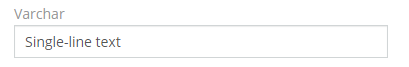
Varchar
A single-line text.
Parameters:
- Max-length – a max acceptable length of text;
- Options – a pre-defined list of values for an autocomplete;
- Pattern – a regular expression to check a field value against;
- Copy to clipboard button.
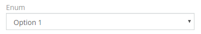
Enum
Selectbox, only one value can be selected.
Parameters:
- Options – a list of values (key => label pairs); a color (style) for each value can be specified (applied when param Display as Label is enabled);
- Options Reference – options from another field to re-use (as of v7.5);
- Is Sorted – to sort a list alphabetically;
- Display as Label – a value will be displayed as a label with color; a color for each option can be specified.
It's possible to define conditional options with Dynamic Logic.

Note
An empty option can be used to support a null value. Usually, it's reasonable to have it first in the list.
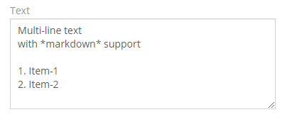
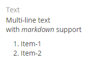
Text
A multiline text with markdown support.
Parameters:
- Max-length – a max acceptable length of a text;
- Disable Text Cut – if not checked, then long texts will be shortened and can be expanded (for the detail view mode);
- Number of rows of textarea – a max number of rows before scroll bar appears (for the edit view mode);
- Cut Height (px) – a max height of a text, if longer, then it will be cut (for the detail view mode);
- Display raw text (no markdown) – to disable markdown support;
- Preview – the ability to preview a Markdown text;
- Attachment Field – an Attachment-Multiple field to connect the Text field with.
Date
Date w/o time.
Parameters:
- After (field) – a validation: a date value should be after a date value of a specified field;
- Before (field) – a validation: a date value should be before a date value of a specified field;
- Use Numeric Format – if not checked, then words 'today', 'yesterday', 'tomorrow' are in the detail view mode.

Date-Time
Date and time.
Parameters:
- After (field) – a validation: a date value should be after a date value of a specified field;
- Before (field) – a validation: a date value should be before a date value of a specified field;
- Use Numeric Format – if not checked, then words 'today', 'yesterday', 'tomorrow' are in the detail view mode;
- Minutes Step – defines items displayed in the minutes dropdown (in the edit mode).

Currency
A currency value. A float number with a currency code.
Parameters:
- Min – a validation: min acceptable value; if empty, then no validation applied;
- Max – a validation: max acceptable value; if empty, then no validation applied;
- Only default currency – only one (default) currency will be available if enabled;
- Disable Conversion – the currency conversion action won't change the currency of the field;
- Decimal – use decimal data type (when precision is necessary) (as of v7.4).

Int
A whole number.
Parameters:
- Min – a validation: min acceptable value; if empty, then no validation applied;
- Max – a validation: max acceptable value; if empty, then no validation applied;
- Disable Formatting – if not checked, then a value is formatted with a thousand separator.
Float
A number with a decimal part.
Parameters:
- Min – a validation: min acceptable value; if empty, then no validation applied;
- Max – a validation: max acceptable value; if empty, then no validation applied;
- Decimal Places – how many numbers of decimal part to display in read mode.
Decimal
As of v9.3.0.
A decimal number with fixed point precision. In the application, the value is represented as string. In the database – as DECIMAL.
- Min – a validation: min acceptable value; if empty, then no validation applied;
- Max – a validation: max acceptable value; if empty, then no validation applied;
- Decimal Places – how many numbers of decimal part to display in read mode.
Boolean
A checkbox. Two possible values: true and false.

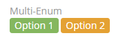
Multi-Enum
A list of values, multiple values can be selected. The list is ordered.
Parameters:
- Options – a list of values (key => label pairs); a color (style) for each value can be specified (applied when param Display as Label is enabled);
- Options Reference – options from another field to re-use (as of v7.5);
- Is Sorted – to sort a list alphabetically;
- Allow Custom Options – if checked, a user can add custom values (not defined by Options parameter) by typing text and pressing the enter key;
- Max Item Count – a validation: how many items can be added;
- Display as Label – values will be displayed as a label with color; a color for each option can be specified;
- Display as List – each value will be displayed in a new line;
- Pattern – a regular expression to check a field value against.
Checklist
A list of checkboxes.
Parameters:
- Options – a list of values (key => label pairs); a color (style) for each value can be specified (applied when param Display as Label is enabled);
- Options Reference – options from another field to re-use (as of v7.5);
- Is Sorted – to sort a list alphabetically;
- Max Item Count – a validation: how many items can be checked;
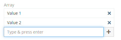
Array
A list of values, similar to Multi-Enum field.
Parameters:
- Options – a list of values (key => label pairs); if no options specified, then a user will be able to add any options;
- Options Reference – options from another field to re-use;
- Empty string value is not allowed – if not checked, a user can add an empty string as an item;
- Max Item Count – a validation: how many items can be added;
- Display as List – each value will be displayed in a new line;
- Items Editable – items can be edited; applicable only if no options are specified for the field; as of v9.2;
- Pattern – a regular expression to check a field value against.
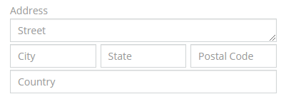
Address
An address with street, city, state, postal code and country.
Url
For storing links.
Parameters:
- Max-length – a max acceptable length of text;
- Require Protocol – if enabled, an URL must contain the protocol part (as of v10.0);
- Strip – if checked, then a protocol part and trailing
/will be stripped; - Copy to clipboard button.
Url-Multiple
As of v7.5.
For storing multiple links.
Parameters:
- Max Item Count – max number or items;
- Strip – if checked, then a protocol part and trailing
/will be stripped.
Wysiwyg
Similar to the Text field, but with HTML support.
Parameters:
- Height (px) – a height of the field (in the edit view mode); if empty – then height is flexible;
- Min Height (px) – a min height of the field (in the edit view mode);
- Use Iframe – if checked, then an HTML content will be placed in an IFRAME element.
File
For file uploading.
Parameters:
- Source List – allows a user to get a file from another record (Documents source is available out-of-the-box);
- Max File Size (Mb) – a validation;
- Accept – which file types can be accepted; see info about file types.
Image
For image uploading.
Parameters:
- Preview Size – defines a size of an image displayed on the detail/list view;
- Max File Size (Mb) – a validation;
- Capture – Specifies which camera to use for capture of image data. Options: Empty, User or Environment. As of v10.0.
Attachment-Multiple
Allows to upload multiple files.
Parameters:
- Source List – allows a user to get a file from another record (Documents source is available out-of-the-box);
- Max File Size (Mb) – a validation;
- Accept – which file types can be accepted; see info about file types;
- Preview Size – defines a size of an image displayed on the detail/list view.
Number
An auto-incrementing number of string type with a possible prefix and specific length.
Parameters:
- Prefix – a text that will be preprended to a number;
- Next Number – a number that will be applied to the next created record;
- Pad Length – a length of the numeric part; if less, then will be padded with zero digits, e.g.
00001; - Copy to clipboard button.

Auto-increment
A generated read-only auto-incrementing integer number.
Barcode
A barcode. Can be printed to PDF.
Parameters:
- Code Type – a type of barcode; supported types: CODE128, CODE128A, CODE128B, CODE128C, EAN13, EAN8, EAN5, EAN2, UPC, UPCE, ITF14, pharmacode, QRcode;
- Last Character – for EAN13 type, often is
>.
Foreign
A field of a related record. Read-only.
Parameters:
- Link – defines where the field will be taken from.
- Field – a field of a related record;
- Relate on Import – when importing, it will automatically relate a record with a matching foreign record.
Email
A set of email addresses with their parameters: Opted-out, Invalid, Primary.
Phone
A set of phone numbers with their parameters: Type, Opted-out, Invalid, Primary.
Parameters:
- Type List – a list of types available for phone numbers (e.g. Home, Office).
Link
A record related through Belongs-To (many-to-one or one-to-one) relationship.
Parameters:
- Create Button – display Create button;
- Autocomplete on empty input – show suggestions even if no characters are entered in the input.
Link-Parent
A record related through Belongs-To-Parent relationship. Can be of different entity types.
Parameters:
- Entity List – a list of entity types available to be related through the field;
- Autocomplete on empty input – show suggestions even if no characters are entered in the input.
Link-Multiple
A set of records related through Has-Many (many-to-many or one-to-many) relationship. Not all relationships have a link-multiple field. Only those do, where Link-Multiple parameter(s) is enabled.
Parameters:
- Max Item Count – the max number of records;
- Create Button – display Create button;
- Autocomplete on empty input – show suggestions even if no characters are entered in the input.